Brand Assets
Maileroo Brand Assets
Download official Maileroo logos, brand colors, typography, and visual resources for presentations, integrations, media coverage, and marketing materials.

 Logo
LogoOfficial Maileroo Logos
Use the correct Maileroo logo version for every touchpoint. Download official logo files in multiple formats and keep the brand clear, consistent, and recognizable across digital, print, and partner materials.



 Brand Colors
Maileroo Brand Colors
Use the official Maileroo color palette consistently across digital products, marketing materials, presentations, and partner content to keep every brand touchpoint clear, cohesive, and instantly recognizable.
 Brand Guidelines
Maileroo Brand Guidelines
Follow these guidelines to use Maileroo logos, colors, typography, and brand elements consistently across digital products, marketing materials, presentations, and partner communications.
Maileroo uses several logo variations to ensure flexibility across different formats, backgrounds, and applications.
The Combination Mark combines the kangaroo icon with the Maileroo wordmark and should be used for most brand communications, including websites, presentations, marketing materials, and larger digital layouts.
The App Icon is designed for compact placements where the full logo may not fit comfortably, such as favicons, social media avatars, app interfaces, and other small-format applications.


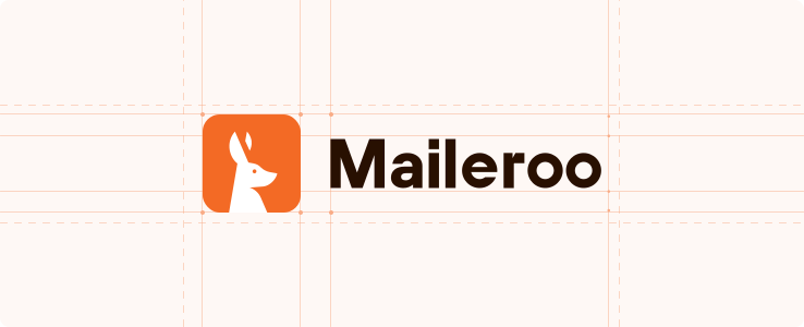
Clear space defines the minimum area surrounding the Maileroo logo that must remain free from text, graphics, or other visual elements.
Maintaining this space helps keep the logo clear, balanced, and easy to recognize across every application.
A consistent buffer should always be preserved around the logo to prevent nearby elements from competing with the mark or reducing its visual impact.
The Maileroo logo should always maintain strong contrast against its background to ensure clarity and legibility.
Use approved logo variations on backgrounds that keep both the kangaroo icon and wordmark clearly visible and visually balanced.
Avoid colour combinations that reduce contrast, make parts of the logo difficult to read, or introduce unapproved brand colours.





The monochrome Maileroo logo provides a flexible alternative for situations where the full brand colour palette cannot be used.
It may be applied in solid light or dark variations depending on the background and should always maintain strong contrast and clear visibility.
Use monochrome versions for print, engraving, embossing, restricted colour environments, or other applications where simplified reproduction is required.
Typography plays an important role in the Maileroo brand identity. Our type system combines a distinctive brand typeface with a modern digital typeface to ensure consistency across every touchpoint.
TT Hoves Pro is used for the Maileroo logo and selected brand applications, providing a recognizable and unique visual character.
For digital experiences, websites, and product interfaces, Geist and TWK Lausanne support a clean, modern, and highly readable experience across all user interactions.